Photo-realistic Renderings: Necessary Imperfections
One of the reasons many companies choose renderings over photography is the ability to customize the images completely. To create the exact atmosphere they want under perfect conditions void of dust, unwanted shadows, and imperfections. But more often than not, imperfections are necessary to creating a truly photo-realistic rendering.
When creating a realistic environment, our rendering team strategically includes “perfect imperfections” like a chair that isn’t pushed in, intense shadows, or even a rough texture to add some wear and tear. While many companies prefer a perfectly polished image, adding these perfect imperfections make the image feel more familiar and, in turn, more engaging.
In creating our most convincing renderings, we’ve found that the following features are a huge part of what makes them so believably realistic:
LIGHTING
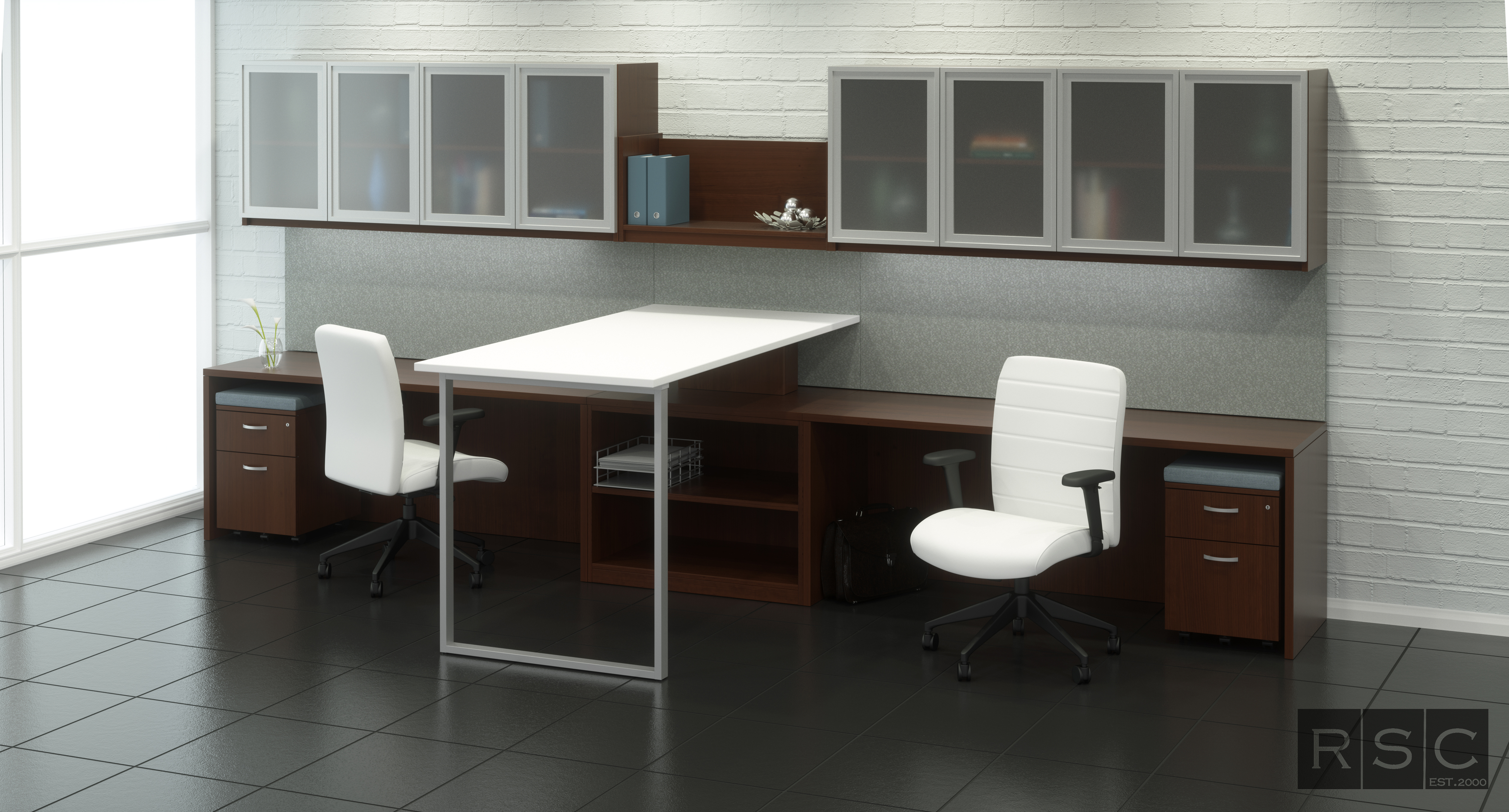
Shadows and reflections are part of our every day life. That’s why when we build out our rendered environments, we always request a lighting plan so that we can accurately replicate the light reflections and shadows of your actual property. We also include a sun path that provides natural lighting patterns for environments with windows. Including the shadows and reflections from both light sources makes the scene feel more realistic because your audience is used to seeing those light patterns in real life every single day. A rendering without the light patterns we’re all accustomed to will make viewers feel like something’s missing. In the image above, you can clearly see both light patterns: the strong shadows caused by natural light coming in the windows and the reflections of the ceiling lights in the glass walls and windows.
TEXTURES
In real life, most objects have textures. A wooden table has hundreds of grooves, a blanket consists of  thousands woven threads, and poured concrete has bumps a bubbles all over the place. Our eyes are used to seeing textures, whether they’re intentional (like woven threads) or unintentional (like wear and tear on a high traffic floor) and they’re also trained to notice when a texture is missing. In the image above, we added rough texture to the brick wall and a subtle gritty texture to the tiles because our audience is subconsciously expecting those familiar textures, not a perfectly polished surface.
SLIGHTLY DISHEVELED ACCESSORIES
It’s nearly impossible to keep an area that humans interact with regularly in perfect condition. Even when we try to keep our offices perfectly tidy, the mess and clutter inevitably creeps in when our back is turned. So we find ourselves feeling skeptical when we see a real environment that’s perfectly tidy. That’s why we add slightly disheveled accessories to our environments, like the unattended coffee cup and the disarranged chair and ped in the background of this image. These slightly disheveled items make us feel more comfortable than perfectly pushed in chairs and neatly organized accessories because it feels more like our real lives.
Imperfections are typically something we like to avoid, but when it comes to photo-realistic renderings, strategic imperfections can yield incredible results. The world around us isn’t perfect and our eyes and brains are used to that. So, embrace the imperfections and wow your audience with truly photo-realistic images.
If you’d like to see more of our work, visit our galleries here. For a quote on an upcoming project, upload your project files to our Hightail site here. We can’t wait to hear from you!


